
SOM Visualisations available in the Java SOMToolbox
Self-Organising Maps have been applied in various industrial applications, and have proven to be a valuable data mining tool. In order to fully benefit from their potential, the user needs to be assisted in analysing and interpreting the maps by advanced visualisation techniques assist.
The Java SOMToolbox provides implementations of the following visualisations:
Vector Activity Histogram
Class Visualisation
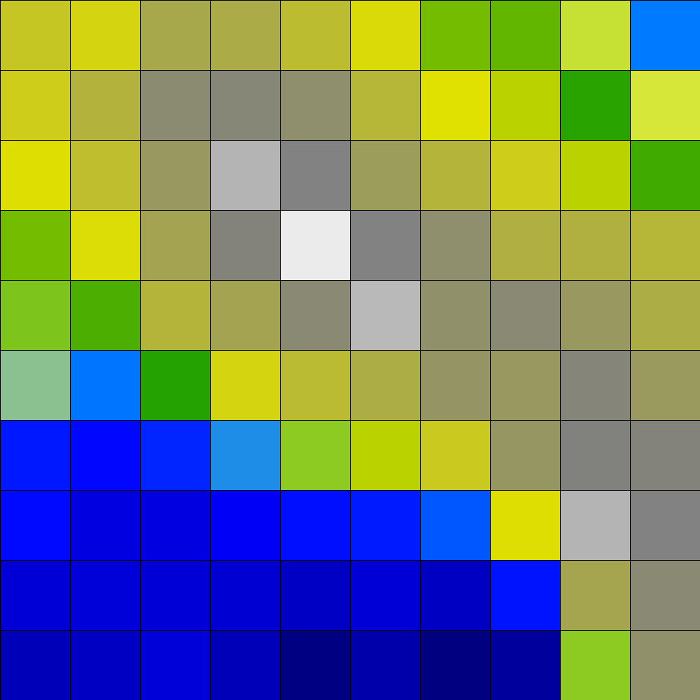
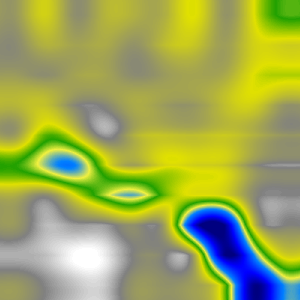
Even though labelled data is not required for the training process of Self-Organising Maps, in many applications class labelling of some sort is available. The Class Visualisation is a visualisation uncovering the distribution and arrangement of the classes over the map. This visualisation helps the user to gain a better understanding and analysis of the mapping created by the SOM, e.g. through comparing the results of the manual labelling and automatic arrangement. The Class Map visualisation technique smoothly colours a SOM according to the distribution and location of the given class labels. It allows the user to easier assess the quality of the manual labelling by highlighting outliers and border data close to different classes.
Rudolf Mayer, Taha Abdel Aziz, and Andreas Rauber. Visualising Class Distribution on Self-Organising Maps. In Proceedings
of the International Conference on Artificial Neural Networks (ICANN'07),
Porto, Portugal, September 9-13 2007. Springer Verlag.
![]()
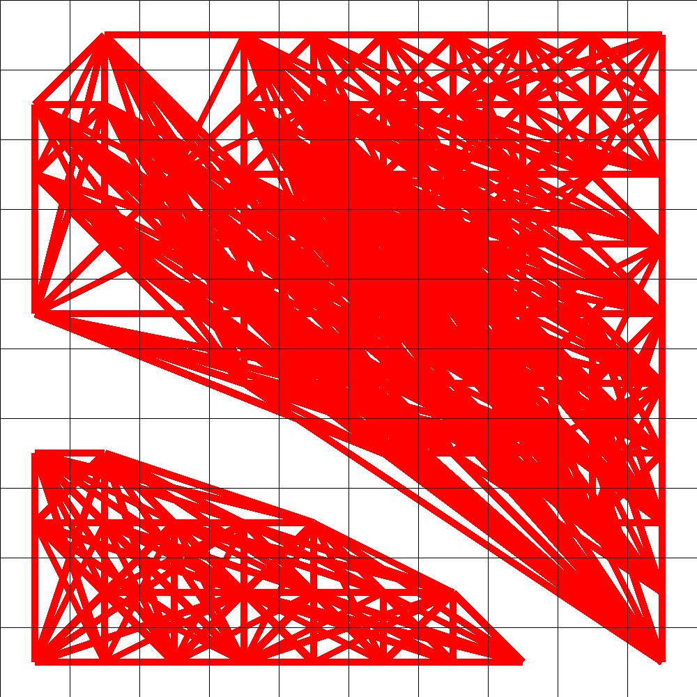
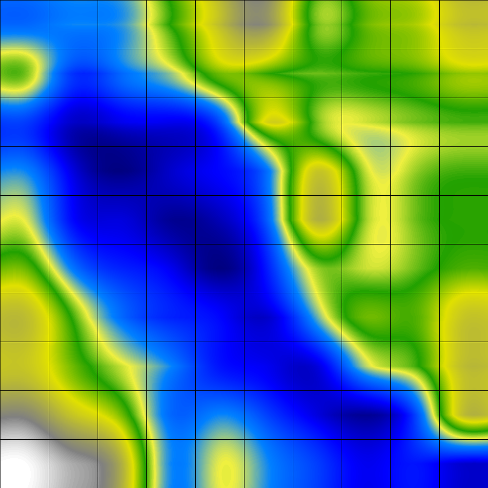
Cluster Connections
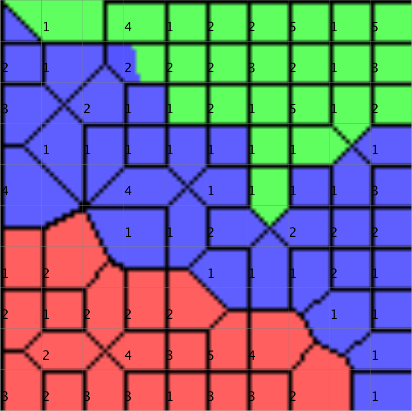
Visualises the relationship of SOM-nodes, to facilitate the detection of cluster boundaries without modifying the architecture or the basic training process of SOM. This is achieved by displaying a grid of connected nodes, where the intensity of the connection, indicated by colour coding, mirrors the similarity of the underlying data items.
Dieter Merkl and Andreas Rauber. Alternative Ways for Cluster Visualization in Self-Organizing Maps. In Proceedings
of the Workshop on Self-Organizing Maps (WSOM97), Helsinki, Finland, June 4-6 1997.
![]()
Component Planes
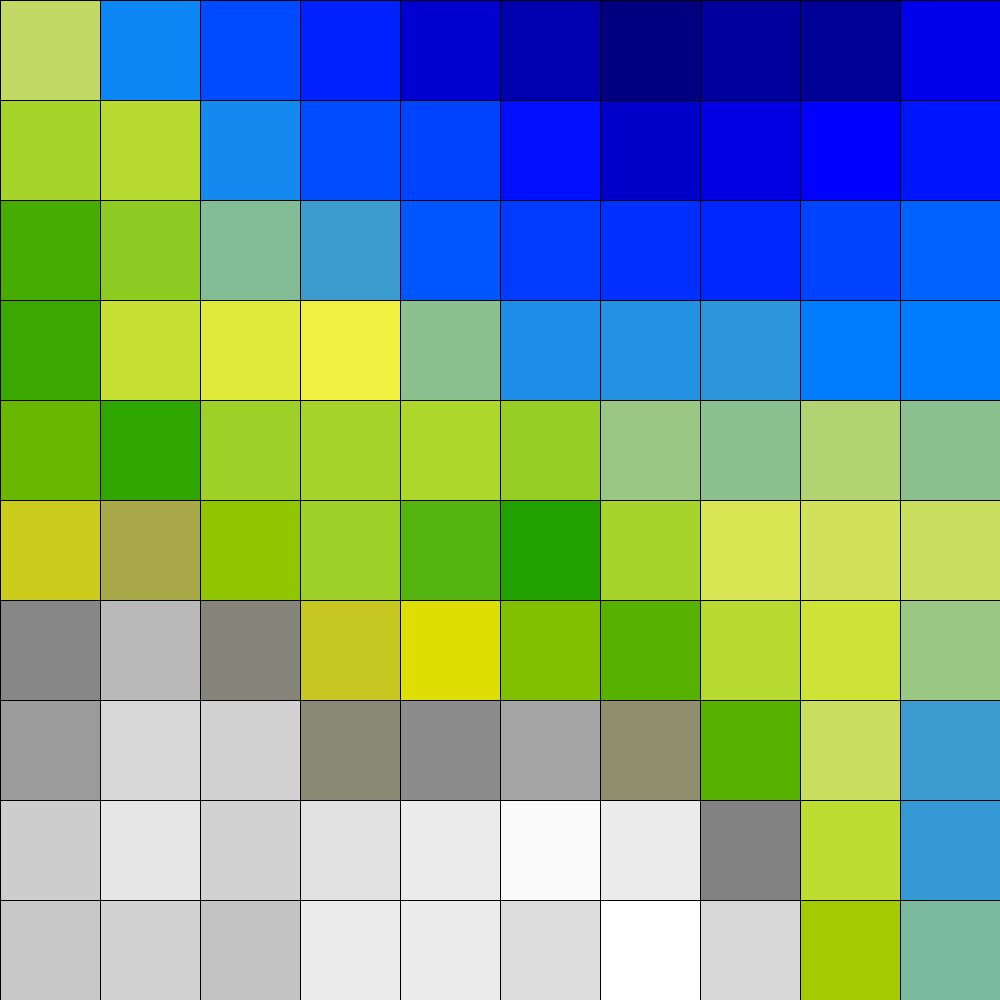
Component planes show the values of a single component (attribute, feature) over the whole map, thus they are useful to see in which map areas a certain attribute has high influence.
They can also be used to identify related attributes, by clustering the component planes
A special type of component planes visualisation is the Rhythm Pattern Attributes Visualisation, which groups a certain set of components together.
Juha Vesanto:SOM-Based Data Visualization Methods. In Intelligent Data Analysis, 3(2):111-126, 1999.
Juha Vesanto and Jussi Ahola: Hunting for Correlations in Data Using the Self-Organizing Map. In Proceeding of the International ICSC Congress on Computational Intelligence Methods and Applications (CIMA '99), pp 279-285. ICSC Academic Press, 1999.
Vector Fields
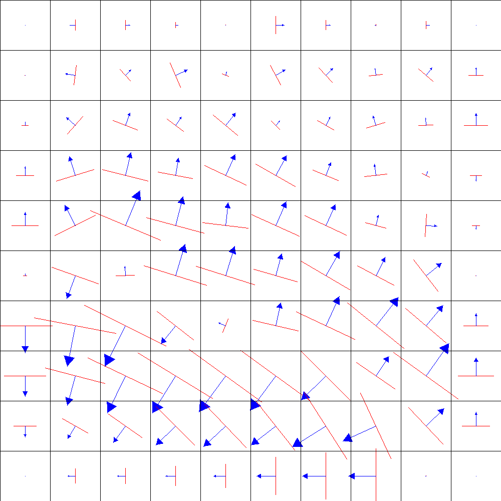
This visualisation provides two different methods for depicting the SOM based on vector fields, namely the Gradient Field and Borderline visualisations, to show the clustering structure at various levels of detail. This method can be used on aggregated parts of the SOM to show which factors contribute to the clustering structure, and for finding correlations and dependencies in the underlying data.
Georg Poelzlbauer, Michael Dittenbach, Andreas Rauber. Advanced visualization of Self-Organizing Maps with vector fields. Neural Networks, 19(6-7):911-922, July-August 2006.
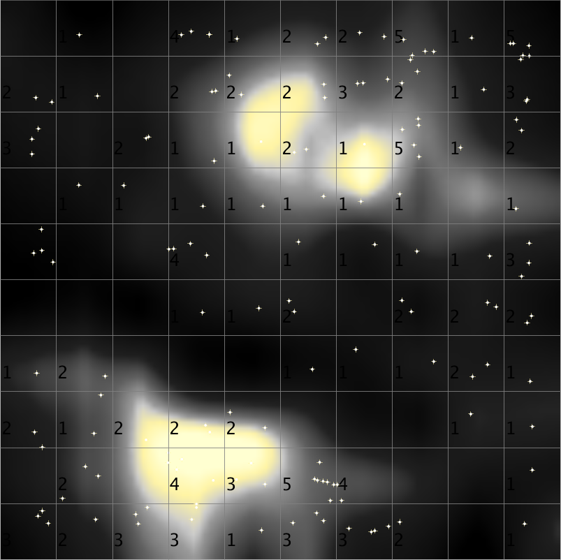
Hit Histogram
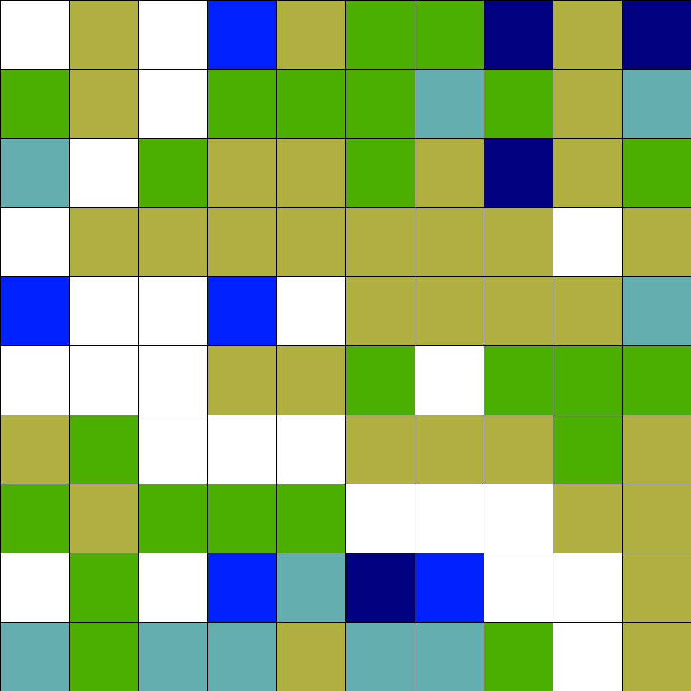
The Hit Histogram visualises density on the SOM, by counting how many input vectors are mapped onto each SOM node. In the Java SOMToolbox, this densitiy is indicated by colour-coding the SOM nodes.
Metro Map
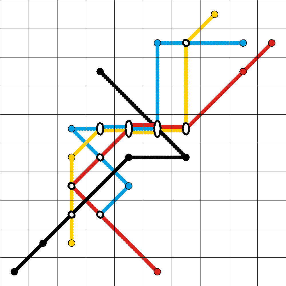
To help in understanding the influence of single variables or components on clusterings, the Metro-Map is a novel method for the visualisation of Component Planes for SOMs. Metro maps are based on the discretisation of the components, and makes use of the well-known metro-map metaphor. It depicts consistent values and their ordering across the map for discretisations of various components and their correlations in terms of directions on the map. Component Lines are drawn for each component of the data, allowing the combination of numerous Component Planes into one plot. It is also possible to further aggregate the visualisation, by grouping highly correlated variables, i.e. similar lines on the map. Further, the most significant components can be selected.
Robert Neumayer, Rudolf Mayer, Georg Pölzlbauer, and Andreas Rauber. The metro visualisation of component
planes for self-organising maps. In Proceedings of the International Joint Conference on Neural Networks (IJCNN'07),
Orlando, FL, USA, August 12 - 17 2007. IEEE Computer Society.
![]()
Robert Neumayer, Rudolf Mayer, and Andreas Rauber. Component selection for the metro visualisation of the
SOM. In Proceedings of the 6th International Workshop on
Self-Organizing Maps (WSOM'07), Bielefeld, Germany, September 3 - 6 2007.
![]()
Minimum Spanning Tree
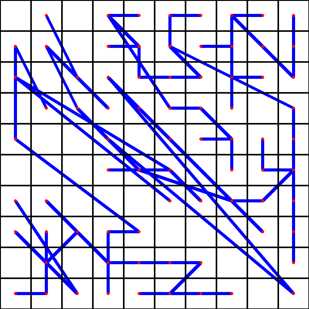
Neighbourhood Graph
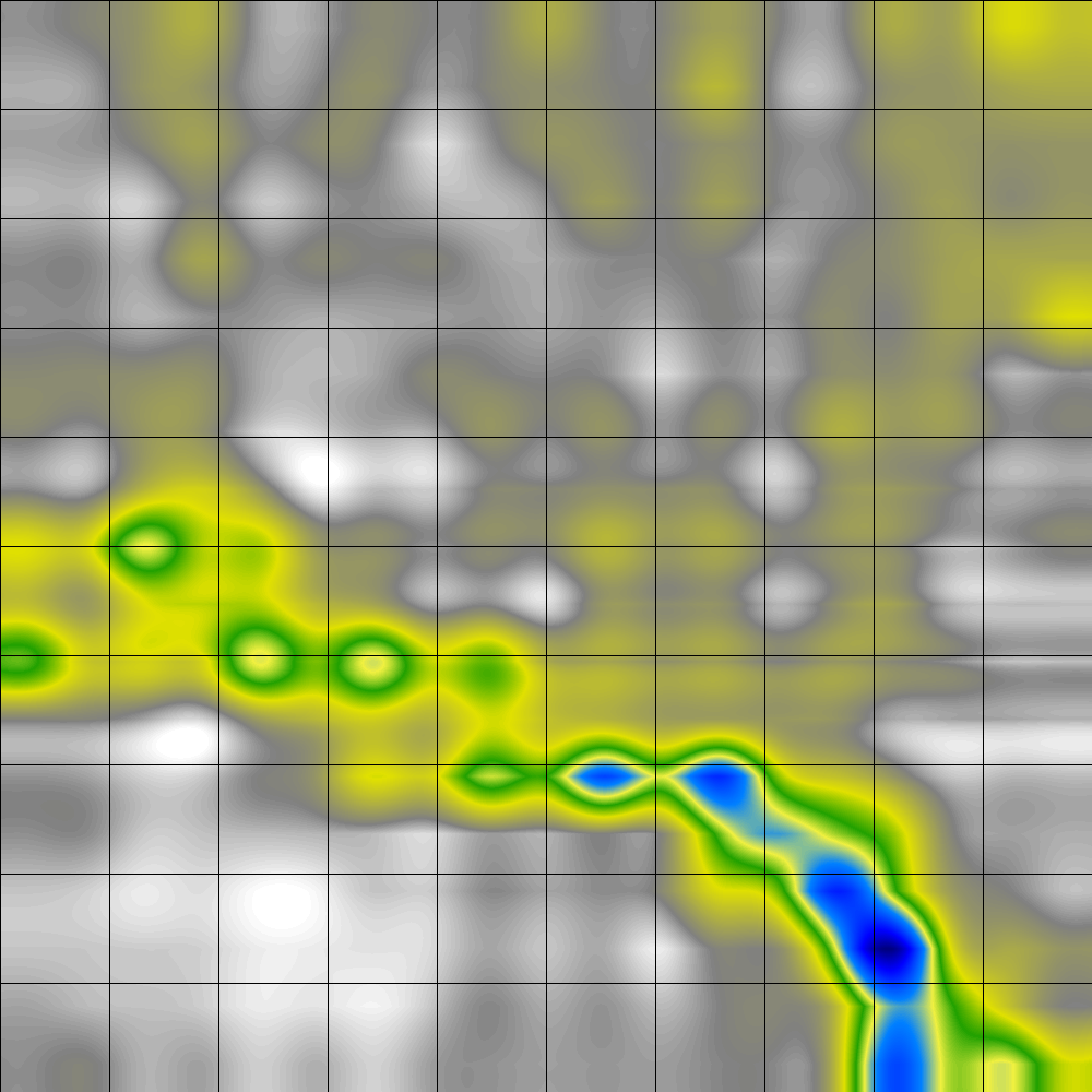
The Neighbourhood Graph is a novel visualisation technique that takes the density of the data into account. The method defines graphs resulting from nearest neighbor- and radius-based distance calculations in the data space, and shows projections of these graph structures on the map. It can then be observed how relations between the data are preserved by the projection, yielding interesting insights into the topology of the mapping, and helping to identify outliers as well as dense regions.
Georg Poelzlbauer, Andreas Rauber, and Michael Dittenbach: >Advanced visualization techniques for
self-organizing maps with graph-based methods. In Proceedings of the Second International Symposium on Neural Networks
(ISNN'05), pp 75-80, Chongqing, China, May 30 - June 1 2005. Springer-Verlag.
![]()
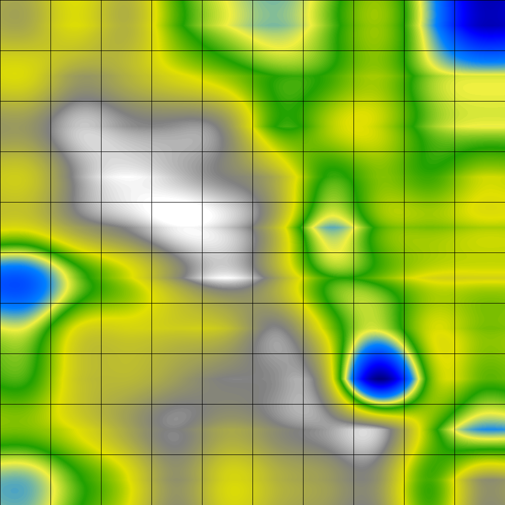
Smoothed Data Histograms
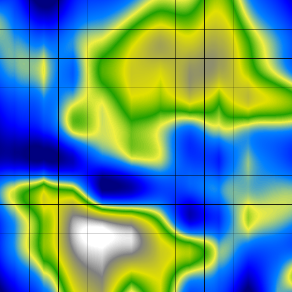
Smoothed Data Histograms are a visualization method that show the data distribution of the data samples by counting a number of most likely positions for each sample. The results can be visualized in a very intuitive landscape-like way, with islands and mountains in densely occupied regions and oceans in between.
Besides the original algorithm, the Java SOMToolbox provides two additional variations, with weighted and normalised weighted distances.
Elias Pampalk, Andreas Rauber, Dieter Merkl. Using Smoothed Data Histograms for Cluster Visualization in
Self-Organizing Maps. In Proceedings of the Intl Conf on Artificial Neural Networks (ICANN 2002), pp.871-876, August
27.-30. 2002, Madrid, Spain.
![]()
Sky Metaphor Visualisation
Although various visualisations have been proposed for Self-Organising Maps, these techniques lack in distinguishing between the items mapped to the same unit. The Sky Metaphor Visualisation is a novel technique for the visualisation of Self-Organising Maps that displays inputs not in the centre of the map units, but shifts them towards the closest neighbours, the degree of the movement depending on the similarity to the neighbours. The night-sky visualisation facilitates better understanding of the underlying data.
Khalid Latif and Rudolf Mayer. Sky-Metaphor Visualisation for Self-Organising Maps. In Proceedings of the 7th International Conference on Knowledge Management
(I-KNOW'07), Graz, Austria, September 5 - 7 2007.
![]()
U-Matrix
The unified distance matrix, or U-Matrix, is calculated as the distance in the input space between weight vectors that are neighbouring each other on the map. For visualization purposes, the average for each node is computed of its topological neighbors. The U-Matrix can be depicted in two ways, either by showing the inter-node distances, or by showing only the average values. The former method requires insertion of additional patches to the map between nodes, and the original positions of the nodes are assigned the average distance values The U-Matrix is suitable to identify possible interpolating units and outliers, as well as dense regions, where inter-node distances are low.
An alternative display is to depict the distance values only
Alfred Ultsch and H. Peter Siemon. Kohonen's self-organizing feature maps for exploratory data analysis. In Proceedings
of the International Neural Network Conference (INNC'90), pages 305-308. Kluwer, 1990.
![]()
P-Matrix
The P-Matrix is a display of the density relationships in the data space using Pareto Density Estimation. While the P-Matrix is useful for clustering, it can also be used for a non-ambiguous display of a non planar neuron space.
Alfred Ultsch. Maps for the Visualization of high-dimensional Data Spaces. In Proceedings
Workshop on Self-Organizing Maps (WSOM 2003), Kyushu, Japan, (2003), pp. 225-230.
![]()
U*-Matrix
Using the U-Matrix methods for clustering has the advantage of a nonlinear disentanglement of complex cluster structures. Distances inside a cluster are, however, depicted in the same manner as distances between different clusters on an U-Matrix. This may prevent the detection of clusters in some data sets. An enhancement of the U-Matrix by taking density information into account is called U*-Matrix. The U*-Matrix shows structures compatible with a clustering of the data by other algorithms. The combination of distance and density information is expected to be very useful for data mining and knowledge discovery.
Alfred Ultsch. U*-Matrix: a Tool to visualize Clusters in high dimensional Data, Technical Report No. 36,
Dept. of Mathematics and Computer Science, University of Marburg, Germany, (2003).
![]()