Information Management and Preservation
Information and Software Engineering Group (IFS)Institute of Software Technology and Interactive Systems (ISIS)
Vienna University of Technology
Data Mining is the task of finding interesting patterns in databases in order to deduct rules for future measurements. It is an important research area that is related to a wide range of disciplines, such as statistics, neurocomputing, and database theory, and has applications in nearly every engineering domain, marketing, and finance.
The Data Mining Group at IfS conducts research into data mining methods, and in particular the Self-Organizing Map (SOM). The SOM is a prominent technique for exploratory data analysis and visualization of complex high-dimensional data sets. The Data Mining Group especially investigates applications to large document collections and post-processing visualizations of the SOM.
Contact: Andreas Rauber.
Self-Organising Maps
The Self-Organising Map is a popular unsupervised neural network model which has successfully been used for analysing various
kinds of data. The SOM performs both a vector quantisation, i.e. finding of prototypical representatives of the data, such as in
k-means clustering, as well as a vector projection, that performs topology-preserving mapping from a high-dimensional input space
to a normally two-dimensional output space, the map.
Our group has extensive knowledge on SOMs; some of our work is
illustrated below. We also release the open-source Java SOMToolbox
Java SOMToolbox
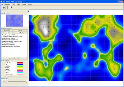
The Java SOMToolbox is an open-source toolkit implemented in Java, that allows you to easily train self-organising maps, and analyse them with an advanced viewer application, which implements a large range of different visualisations and quality measures of the SOM. These allow in-depth analysis and evaluation of the trained maps and the characteristics of the data, resulting in a powerful tool for data mining.[SOMToolbox website]
Visualisations for Matlab Toolbox
As an add-on to the Matlab SOMToolbox, we provide a set of visualisations, along with a graphical interface. We add Neighbourhood Graphs, Gradient Fields, P-Matrix and U*-Matrix, and the Metro Map. Moreover, our software package includes several map quality measures, as well as clustering techniques such as k-means and Ward's linkage that can be applied on the SOM lattice.[SOMVIS website]
Smoothed Data Histograms
Smoothed Data Histograms are a visualization method for Self-Organizing Maps that show the data distribution of the data samples by counting a number of most likely positions for each sample. The results can be visualized in a very intuitive landscape-like way, with islands and mountains in densely occupied regions and oceans in between.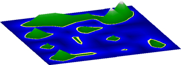
Gradient Field & Borderline
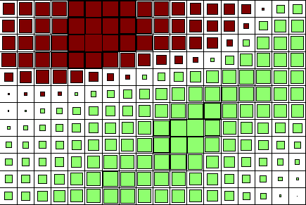
The Gradient Field method is a visualization technique that aims at providing insight into the clustering structure of a Self-Organizing Map by a vector field representation. The arrows are pointing towards cluster centres and away from dissimilar regions on the map. This method has been extended for discriminative plotting of groups of variables, and by rotating the vectors by 90 degrees such that the boundaries are depicted directly.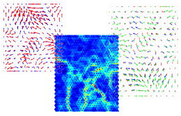
Graphical Methods
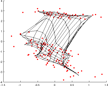
Graphical methods for the visualization of Self-Organizing Maps provide a unique view of the adjacency of the clusters. Data points are connected visually on the map if they are within a certain range in the original input space. Thus, dense regions can be identified as well as outliers. Further, it can be observed which regions on the map are related to each other although not necessarily next to each other, an effect that frequently occurs with high-dimensional data.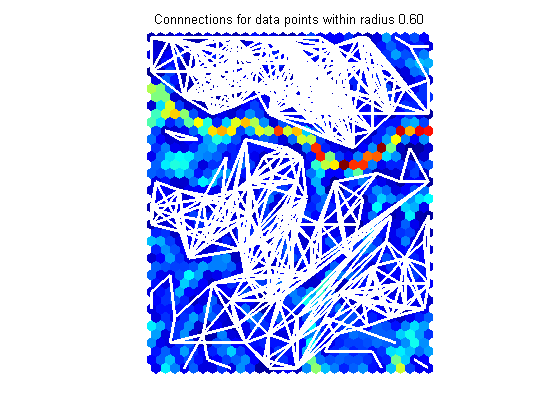
Metro Map
The Metro Map is a novel visualisation, helping to uncover the influence of single variables (components) on the SOM clustering. It is based on the discretisation of the components and makes use of the well-known metro map metaphor. Component Lines are drawn for each component of the data, allowing the combination of numerous Component Planes into one plot It thus depicts consistent values and their ordering across the map, as well as component correlations. It is also possible to further aggregate the display, by grouping highly correlated variables, i.e. similar lines on the map.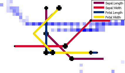
Sky Metaphor Visualisation
Although various visualisations have been proposed for Self-Organising Maps, these techniques lack in distinguishing between the items mapped to the same unit. The Sky Metaphor Visualisation is a novel technique that displays inputs not in the centre of the map units, but shifts them towards the closest neighbours, the degree of the movement depending on the similarity to the neighbours. The night-sky visualisation facilitates better understanding of the underlying data.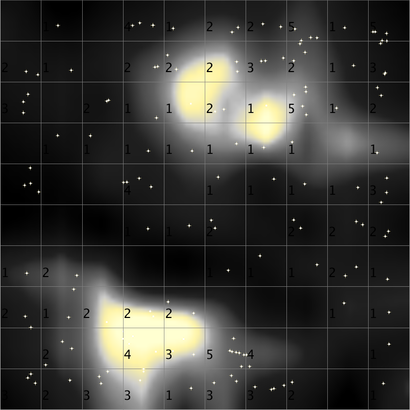
Analytical Comparison of SOMs
There are very few visualisations for directly comparing two or more SOMs with each other. Thus we developed three visualisations to compare SOMs, trained on the same dataset but with different parameters, to visualise where the data gets projected on each map and to assess the stability and quality of the mappings. The analysis of shifts in position can be for single data vector or on a cluster level, while the Multi-SOM Comparison Analysis assesses the stability of the SOM's data projection in multiple maps.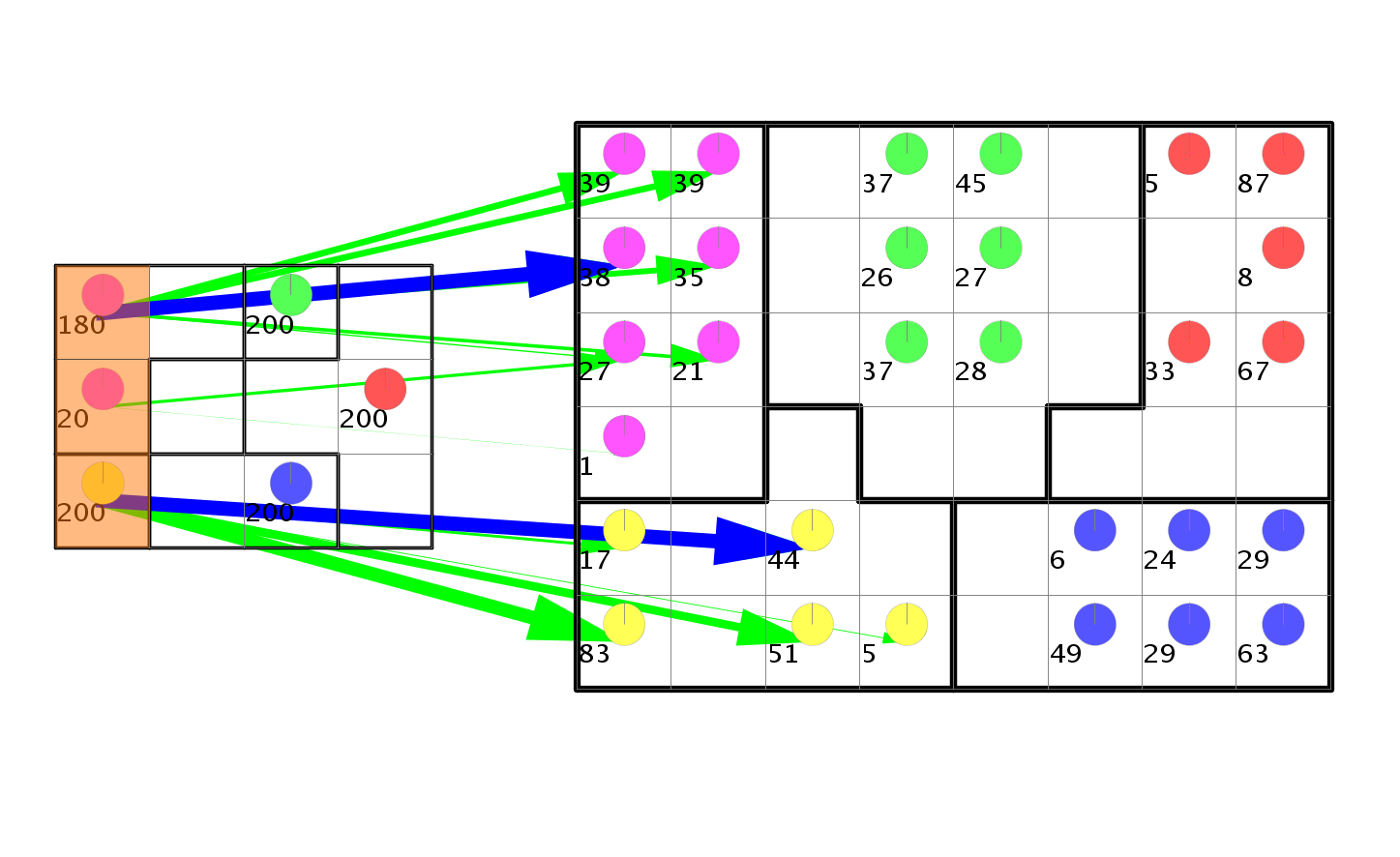
Mnemonic SOM
The mnemonic SOM is an adaption of the original SOM algorithm that utilisizes non-rectangular shapes. The idea is to present to the user shapes, such as country or continent maps, or geometrical shapes such as icons, he is familiar with. This will allow an easier description of the location of certain data items, and provides an additional mnemonic clue for remembering the locations and relationships between clusters.[Details]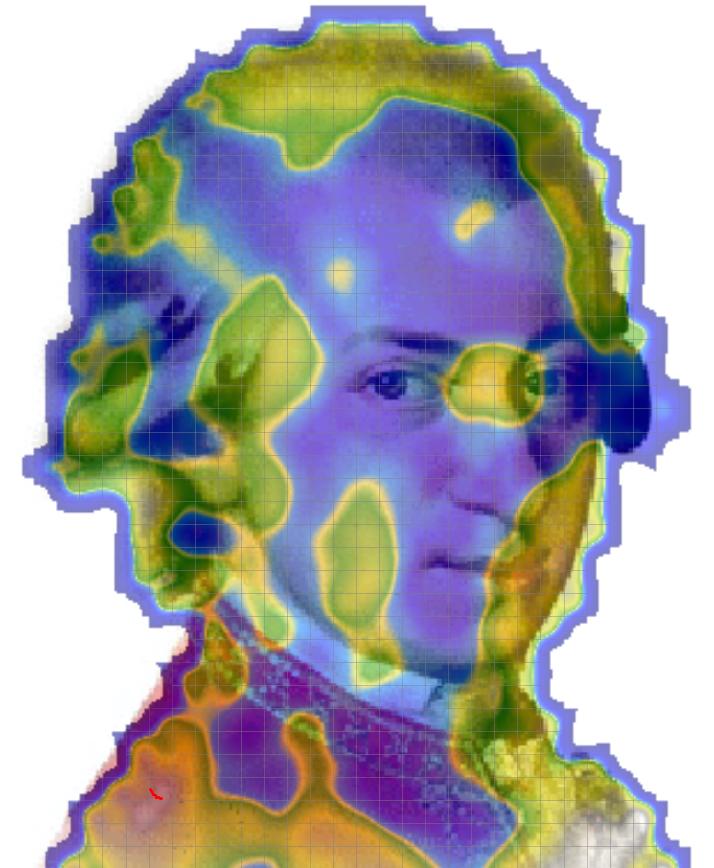
Growing Hierarchical SOM
The Growing Hierarchical Self-Organizing Map (GHSOM) is an extension of the original SOM algorithm that modifies the network topology such that it can grow both in map size and in depth. The training algorithm automatically selects the most fitting hierarchical structure for a given data set. The GHSOM provides a structural representation that is rough on the first layer and can be zoomed into if the fine details are of interest. It has been applied to various document databases, where the most similar articles are grouped together. [Details]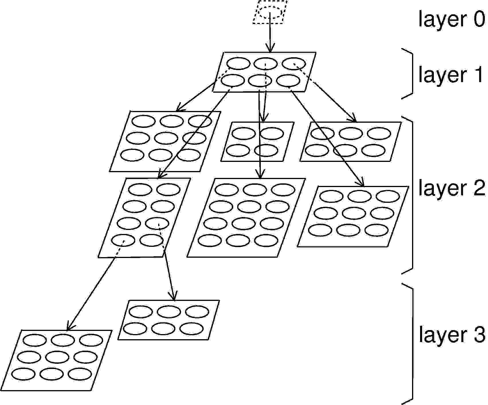
Machine Learning
Decision Manifolds
Decision Manifolds are a classifier algorithm that approximates the decision surface of labeled data by a patchwork of separating hyperplanes. The hyperplanes are arranged in a way inspired by how Self-Organizing Maps are trained. The algorithm takes advantage of the fact that the boundaries can often be approximated by linear ones connected by a low-dimensional nonlinear manifold. The resulting classifier allows for a voting scheme that averages over neighboring hyperplanes. The algorithm is computationally efficient both in terms of training and classification. It further includes a model selection framework for estimation of the paratmeters of the classification boundary.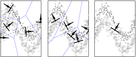
Machine Learning Data Sets
The multi-challenge data set was created to demonstrate how a data analysis method deals with clusters of different densities and shapes when these different characteristics are present in the same data set. It consists of several sub-data sets that are placed in a 10-dimensional space. The subsets themselves may live in spaces of lower dimensions. [Details and Downloads].