Vienna University of Technology
| |
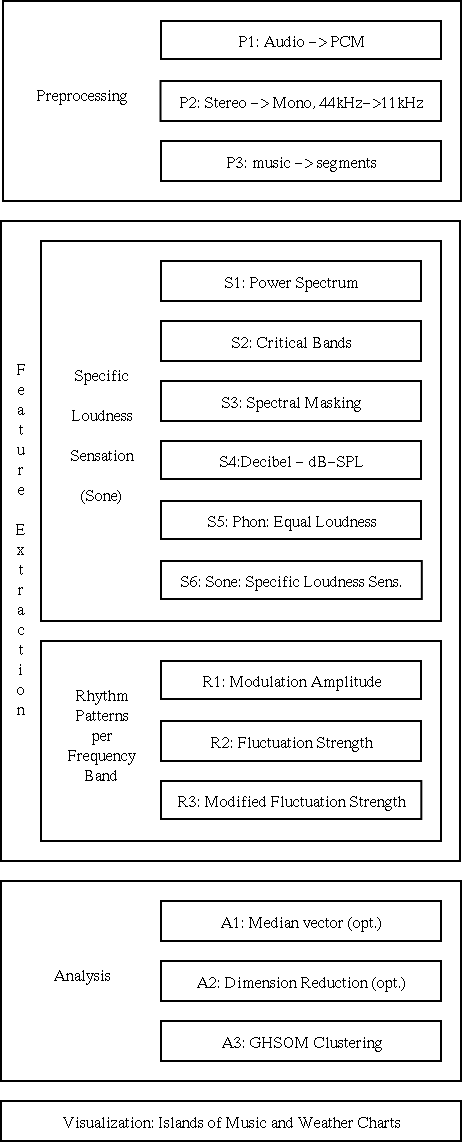
| SOMeJB System Architecture: preprocessing, 2-stage feature extraction, cluster analysis and visualization | |
(Up to the Overview)
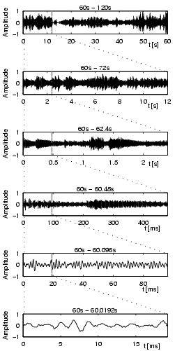
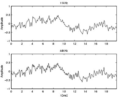
Figure 1 illustrates 44kHz PCM data at different magnitude levels. The song Freak on a Leash by Korn is rather aggressive, loud, and perhaps even a little noisy. At least one electric guitar, a strange sounding male voice, and drums create a freaky sound experience. In contrast F�r Elise by Beethoven is a rather peaceful, classical piano solo. These two pieces of music will be used throughout the thesis to illustrate the different steps of the feature extraction process. The envelope of the acoustical wave in F�r Elise over the interval of one-minute has several modulations and seldom reaches the highest levels, while Freak on a Leash is constantly around the maximum amplitude level. There is also a significant difference in the interval of only 20 milliseconds (ms), where Freak on a Leash has a more jagged structure than F�r Elise.
| ||
| Figure 1: The 44kHz PCM data of two very different pieces of music at different time scales. The titles of the sub-plots indicate their time intervals. The second minute was chosen since the first minute includes fade-in effects. Starting with an interval of 60 seconds each subsequent sub-plot magnifies the first fifth of the previous interval. This is indicated by the dotted lines. For each of the two pieces of music, the amplitude values are relative to the highest amplitude within the one-minute intervals. | ||
|
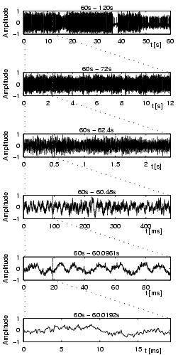
| Figure 2: The effects of down-sampling on a 20ms sequence of Freak on a Leash. This sequence is the same as the one in the last sub-plot of Figure 1. |
Step P3: Segmentation and Segment Selection
Using only a small fraction of an
entire piece of music should be sufficient since humans are able
to recognize the genre within seconds. Often it is possible to
recognize the genre by listening to only one 6-second sequence of a piece of music. A more accurate classification is possible if a few sequences
throughout the piece of music are listened to. However, the first and the last seconds of a piece of music usually contain fade-in and fade-out effects, which do not help in determining the genre.
We thus segment each piece of music into segments of 6 seconds length. The first two as well as the last two segments are removed from the data set.
Furthermore, to reduce the amount of data involved, re retain only every third segment for further analysis.
The chosen segment length, as well as the number of segments retained have shown only insignificant influence on the quality of the final results in various experiments, amking further reductions feasible.
The resulting down-sampled audio segments are used as input to the actual feature extraction process.
(Up to the Overview)
3. Feature Extraction
The process of extracting the patterns consists of 9 transformation steps and is divided into two main stages.
In the first stage, comprising steps S1-S6, the loudness sensation per frequency band (Sone) in short time intervals is calculated from the raw music data.
In the second stage, comprising steps R1-R3, the loudness modulation (rhythm patterns) in each frequency band over a time period of 6 seconds is analyzed in respect to reoccurring beats.
3.1. Steps S1 - S6: Loudness sensation
Loudness belongs to the category of intensity sensations. The
loudness of a sound is measured by comparing it to a reference
sound. The 1kHz tone is a very popular reference tone in
psychoacoustics, and the loudness of the 1kHz tone at 40dB is
defined to be 1 sone. A sound perceived to be twice as
loud is defined to be 2 sone and so on.
In the first stage of the feature extraction process, the specific loudness sensation (Sone) per critical-band (Bark) in short time intervals is calculated in 6 steps starting with the PCM data, which, in a nutshell, can be described as follows:
We will now take a closer look at these various steps in more detail and discuss their effect on the data representation.
Step S1 - Power Spectrum:
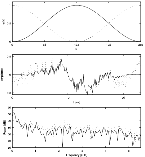
First the power spectrum of the audio signal is calculated. To do this, the raw audio data is first decomposed into its frequencies using a Fast Fourier Transformation (FFT). We use a window size of 256 samples which corresponds to about 23ms at 11kHz, and a Hanning window with 50% overlap.
Figure 3 depicts the characteristics of the Hanning function and the effects it has on the power spectrum.
|
| Figure 3: The upper sub-plot shows the Hanning function over an interval of 256 samples plotted with the solid line. The dotted lines indicate the values for the Hanning functions with 50% overlap. The center sub-plot depicts the effects of the Hanning function applied to a signal. It is taken from Freak on a Leash, sampled at 11kHz, in the interval 60s to 60s+23ms. The solid line is the result of multiplying the Hanning window with the sample values, the dotted line is the original waveform. Notice that while the original signal starts with an amplitude of about -0.25 and ends with an amplitude of 0.17, the signal multiplied with the Hanning function starts and ends at zero. The lower subplot shows the effects of the Hanning function in the frequency domain. Again the solid line represents the signal to which the Hanning function has been applied, and the dotted line represents the original signal. |
Step S2: Critical-Bands [Bark]:
The inner ear separates the frequencies,
transfers, and concentrates them at certain locations along the
basilar membrane. The inner ear can be regarded as a complex
system of a series of band-pass filters with an asymmetrical
shape of frequency response. The center frequencies of these
band-pass filters are closely related to the critical-band rates.
Where these bands should be centered or how wide they should be, has been analyzed throughout several psychoacoustic experiments. While we can distinguish low frequencies of up to about 500Hz well, our ability decreases above 500Hz with approximately a factor of 0.2f, where f is the frequency. This is shown in experiments using a loud tone to mask a more quiet one. At high frequencies these two tones need to be rather far apart regarding their frequencies, while at lower frequencies the quiet tone will still be noticeable at smaller distances.
In addition to these masking effects the critical-bandwidth is
also very closely related to just noticeable frequency variations.
Within a critical-band it is difficult to notice any variations.
This can be tested by presenting two tones to a listener and
asking which of the two has a higher or lower frequency.
Since the critical-band scale has been used very frequently, it has
been assigned a unit, the bark. The name has been chosen in
memory of Barkhausen, a scientist who introduced the phon to
describe loudness levels for which critical-bands play an
important role. Figure 4 shows the main
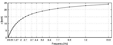
characteristics of this scale. At low frequencies below 500Hz the
critical-bands are about 100Hz wide. The width of the critical
bands increases rapidly with the frequency. The 24th critical-band
has a width of 3500Hz. The 9th critical-band has the center
frequency of 1kHz. The critical-band rate is important for
understanding many characteristics of the human ear.
|
| Figure 4: The basic characteristics of the critical-band rate scale. Two adjoining markers on the plotted line indicate the upper and lower frequency borders for a critical-band. For example, the 24th band starts at 12kHz and ends at 15.5kHz. |
Step S3: Masking Effects:
As mentioned before, the critical-bands are closely related to
masking effects. Masking is the occlusion of one sound by another
sound. A loud sound might mask a simultaneous sound (simultaneous masking), or a sound closely following (post-masking) or preceding (pre-masking) it. Pre-masking is usually
neglected since it can only be measured during about 20ms.
Post-masking, on the other hand can last longer than 100ms and
ends after about a 200ms delay. Simultaneous masking occurs when
the test sound and the masker are present simultaneously.
A spreading function defining the influence of the j-th critical band on the i-th is used to obtain a spreading matrix.
Using this matrix, the power spectrum is spread across the critical bands obtained in the previous step, where the masking influence of a critical band is higher on bands above it than on those below it.
Step S4: Decibel:
Before calculating sone values it is necessary to transform the
data into decibel. The intensity unit of physical audio signals is
sound pressure and is measured in Pascal (Pa). The values
of the PCM data correspond to the sound pressure. It is very
common to transform the sound pressure into decibel (dB).
Decibel is the logarithm, to the base of 10, of the
ratio between two amounts of power. The decibel value of a sound
is calculated as the ratio between its pressure and the pressure
of the hearing threshold given by 20microPa.
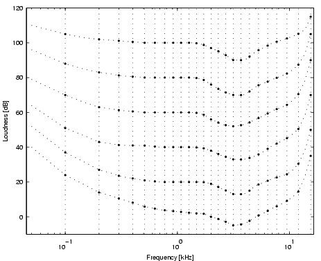
Step S5: Equal Loudness Levels [Phon]:
The relationship between the sound pressure level in decibel and
our hearing sensation measured in sone is not linear. The
perceived loudness depends on the frequency of the tone. Figure
5 shows so-called loudness levels for pure
tones, which are measured in phon. The phon is defined
using the 1kHz tone and the decibel scale. For example, a pure tone
at any frequency with 40 phon is as loud as a pure tone with 40dB
at 1kHz. We are most sensitive to frequencies around 2kHz to 5kHz. The hearing threshold rapidly rises around the lower and upper frequency limits, which are respectively about 20Hz and 16kHz.
|
| Figure 5: Equal loudness contours for 3, 20, 40, 60, 80 and 100 phon. The respective sone values are 0, 0.15, 1, 4, 16 and 64 sone. The dotted vertical lines indicate the positions of the center frequencies of the critical-bands. Notice how the critical-bands are almost evenly spaced on the log-frequency axis around 500Hz to 6kHz. The dip around 2kHz to 5kHz corresponds to the frequency spectrum we are most sensitive to. |
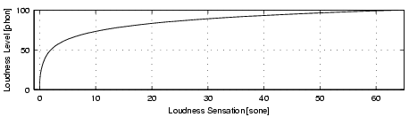
Step S6: Specific Loudness Sensation [Sone]
The relationship between phon and sone can be seen in Figure
6. For low values up to 40 phon the sensation
rises slowly until it reaches 1 sone at 40 phon. Beyond 40 phon
the sensation increases at a faster rate.
|
| Figure 6: The relationship between the loudness level and the loudness sensation. |
Summary of Steps S1-S6:
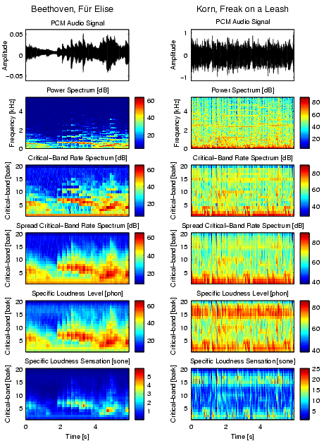
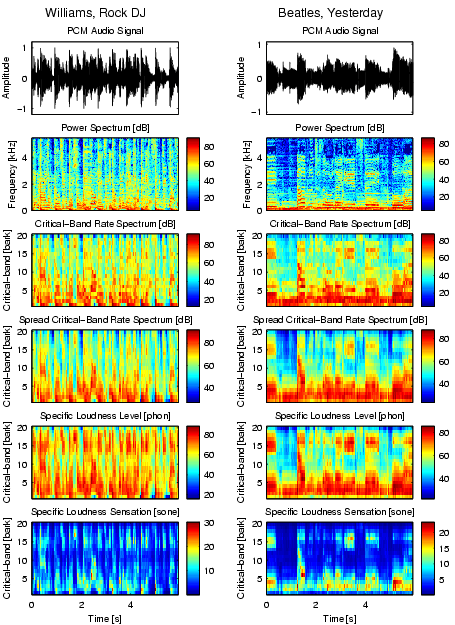
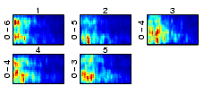
Figures 7 and 8 illustrate the preprocessing steps so far, following transformation steps 1-6. Each piece of music is now represented by several 6-second segments of music. Each of these segments contains information on how loud the piece is at a specific point in time in a specific frequency band.
|
| Figure 7: The feature extraction steps from the 11kHz PCM audio signal to the specific loudness per critical-band. The 6-second sequences of Beethoven, F�r Elise and Korn, Freak on a Leash can be listened too. |
|
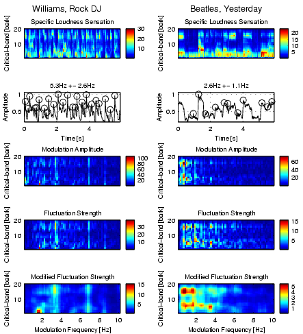
| Figure 8: The same as Figure 7 using 6-second sequences of Robbie Williams, Rock DJ and Beatles, Yesterday. |
(Up to the Overview)
3.2. Steps R1 - R3: Rhythm patterns
The current data representation is not time-invariant. It may thus not be used to compare two pieces of music point-wise, as already a small time-shift of a few milliseconds will usually result in completely different feature vectors.
In the second stage of the feature extraction process, we calculate a time-invariant representation for each piece of music in 3 further steps, namely the rhythm pattern. The rhythm pattern contains information on how strong and fast beats are played within the respective frequency bands.
In a nutshell, these steps are as follows:
(Up to the Overview)
We again will now take a closer look at the four steps.
Step R1: Loudness Modulation Amplitude:
The loudness of a critical-band usually rises and falls several times. Often there is a periodical pattern, also known as the rhythm. At every beat the loudness sensation rises, and the beats are usually very accurately timed.
The loudness values of a critical-band over a certain time period can be regarded as a signal that has been sampled at discrete points in time. The periodical patterns of this signal can then be assumed to originate from a mixture of sinuids. These sinuids modulate the amplitude of the loudness, and can be calculated by a Fourier transform.
An example might illustrate this. To add a strong and deep bass with 120 beats per minute (bpm) to a piece of music, a good start would be to set the first critical-band (bark 1) to a constant noise sensation of 10 sone. Then one could modulate the loudness using a sine wave with a period of 2Hz and an amplitude of 10 sone.
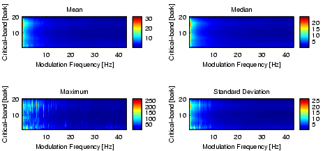
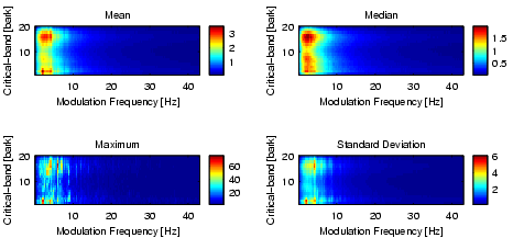
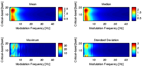
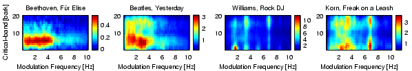
The modulation frequencies, which can be analyzed using the 6-second sequences and time quanta of 12ms, are in the range from 0 to 43Hz with an accuracy of 0.17Hz. Notice that a modulation frequency of 43Hz corresponds to almost 2600bpm. Figure 9 depicts some basic statistics of the data obtained after this step.
|
| Figure 9: The modulation amplitude spectrum of about 4000 6-second sequences. |
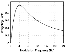
Step R2: Fluctuation Strength:
The amplitude modulation of the loudness has different effects on our sensation depending on the frequency. The sensation of fluctuation strength is most intense around 4Hz and gradually decreases up to a modulation frequency of 15Hz (cf. Figure 10). At 15Hz the sensation of roughness starts to increase, reaches its maximum at about 70Hz, and starts to decreases at about 150Hz. Above 150Hz the sensation of hearing three separately audible tones increases.
|
| Figure 10: The relationship between fluctuation strength and the modulation frequency. |
|
| Figure 11: The fluctuation strength spectrum of about 4000 6-second sequences. |
We further apply a Gaussian filter to increase the similarity between two rhythm pattern characteristics which differ only slightly in the sense of either being in similar frequency bands or having similar modulation frequencies by spreading the according values. The resulting modified fluctuation strength may be used as feature vectors for subsequent cluster analysis.
|
| Figure 12: The modified fluctuation strength spectrum of about 4000 6-second sequences. |
Summary Steps R1-R3:
Figures 13 and 14 summarize these last preprocessing steps.
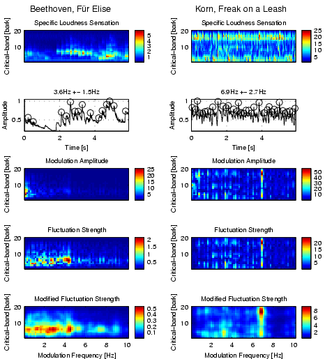
|
| Figure 13: The feature extraction steps from the specific loudness sensation to the modified fluctuation strength per critical-band. The 6-second sequences of Beethoven, F�r Elise and Korn, Freak on a Leash can be listened too. |
|
| Figure 14: The same as in Figure 13 with Robbie Williams, Rock DJ and Beatles, Yesterday. |
(Up to the Overview)
4. Style-based Music Organization using SOMs
Using the typical rhythmic patterns we apply the Self-Organizing Map (SOM) algorithm to organize the pieces of music on a 2-dimensional map display in such a way that similar pieces are grouped close together. We then visualize the clusters with a metaphor of geographic maps to create a user interface where islands represent musical genres or styles and the way the islands are automatically arranged on the map represents the inherent structure of the music archive.
4.1. SOM principles
The self-organizing map (SOM, Kohonen-Map) is one of the
most prominent artificial neural network models adhering to the
unsupervised learning paradigm.
The model consists of a number of neural processing elements, i.e. units.
Each of the units i is assigned an n-dimensional weight vector mi.
It is important to note that the weight vectors have the same dimensionality
as the input patterns.
The training process of self-organizing maps may be described in terms
of input pattern presentation and weight vector adaptation.
Each training iteration t starts with the random selection of one
input pattern x(t).
This input pattern is presented to the self-organizing map and each
unit determines its activation.
Usually, the Euclidean distance between weight vector and input pattern
is used to calculate a unit's activation.
The unit with the lowest activation is referred to as the winner, c,
of the training iteration, i.e.
![]() .
Finally, the weight vector of the winner as well as the weight vectors
of selected units in the vicinity of the winner are adapted.
This adaptation is implemented as a gradual reduction of the
component-wise difference between input pattern and weight vector,
i.e.
.
Finally, the weight vector of the winner as well as the weight vectors
of selected units in the vicinity of the winner are adapted.
This adaptation is implemented as a gradual reduction of the
component-wise difference between input pattern and weight vector,
i.e.
![]() .
Geometrically speaking, the weight vectors of the adapted units are
moved a bit towards the input pattern.
The amount of weight vector movement is guided by a so-called
learning rate, alpha,decreasing in time.
The number of units that are affected by adaptation is determined
by a so-called neighborhood function, hci.
This number of units also decreases in time.
This movement has as a consequence, that the Euclidean distance between
those vectors decreases and thus, the weight vectors become more
similar to the input pattern.
The respective unit is more likely to win at future presentations
of this input pattern.
The consequence of adapting not only the winner alone but also
a number of units in the neighborhood of the winner leads
to a spatial clustering of similar input patters in neighboring parts
of the self-organizing map.
Thus, similarities between input patterns that are present in the
n-dimensional input space are mirrored within the two-dimensional
output space of the self-organizing map.
The training process of the self-organizing map describes a topology
preserving mapping from a high-dimensional input space onto a
two-dimensional output space where patterns that are similar in terms
of the input space are mapped to geographically close locations in
the output space.
.
Geometrically speaking, the weight vectors of the adapted units are
moved a bit towards the input pattern.
The amount of weight vector movement is guided by a so-called
learning rate, alpha,decreasing in time.
The number of units that are affected by adaptation is determined
by a so-called neighborhood function, hci.
This number of units also decreases in time.
This movement has as a consequence, that the Euclidean distance between
those vectors decreases and thus, the weight vectors become more
similar to the input pattern.
The respective unit is more likely to win at future presentations
of this input pattern.
The consequence of adapting not only the winner alone but also
a number of units in the neighborhood of the winner leads
to a spatial clustering of similar input patters in neighboring parts
of the self-organizing map.
Thus, similarities between input patterns that are present in the
n-dimensional input space are mirrored within the two-dimensional
output space of the self-organizing map.
The training process of the self-organizing map describes a topology
preserving mapping from a high-dimensional input space onto a
two-dimensional output space where patterns that are similar in terms
of the input space are mapped to geographically close locations in
the output space.
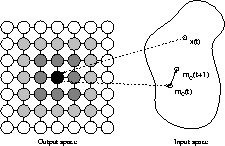
Consider Figure 15 for a graphical representation of self-organizing maps. The map consists of a square arrangement of 7x7 neural processing elements, i.e. units, shown as circles on the left hand side of the figure. The black circle indicates the unit that was selected as the winner for the presentation of input pattern x(t). The weight vector of the winner, mc(t), is moved towards the input pattern and thus, mc(t+1) is nearer to x(t) than was mc(t). Similar, yet less strong, adaptation is performed with a number of units in the vicinity of the winner. These units are marked as shaded circles in Figure 1. The degree of shading corresponds to the strength of adaptation. Thus, the weight vectors of units shown with a darker shading are moved closer to x than units shown with a lighter shading.
As a result of the training process, similar input data are mapped onto neighboring regions of the map.
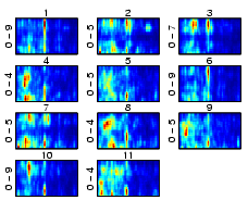
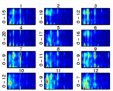
4.3. Clustering Music
Using the SOM, or its hierarchically growing variant, the GHSOM, the data points represented by the 1.200-dimensional feature vectors may be clusterd, resulting in an organized mapping on the maps in such a way that similar data points (i.e. music sounding similar) are located close to each other, either based on the median representation of the feature vectors for each piece of music, or using a two-level clustering approach based on music segments.
However, some intermediary processing steps may be applied optionally, depending on the desired analysis, in order to obtain feature vectors for pieces of music, rather than for music segments, as well as to - optionally - compress the feature space using PCA.
The process of data analysis, comprising steps A1-A4, is described in further detail below.
Step A1: Vector generation:
The segments feature vectors, representing each 6-sec segments characteristics in a 20-critical bands times 60 values, i.e. 1.200 dimensional feature space, may directly and independently analyzed to obtain a mapping of their mutual similarity.
Yet, different strategies for obtaining a single vector representation for each piece of music based on itssegments may be discerned.
Basically, each segment of music may be treated as an independent piece of music, thus allowing multiple assignment of a given piece of music to multiple clusters of varying style if a piece of music contains passages that may be attributed to different genres.
Also, a two-level clustering procedure may be applied to first group the segments according to their overall similarity. In a second step, the distribution of segments across clusters may be used as a finger print to describe the characteristics of the whole piece of music, using the resulting distribution vectors as an input to the second-level clustering procedure.
|
| Figure 16: Beethoven, F�r Elise. |
|
| Figure 17: Korn, Freak on a Leash. |
|
| Figure 18: Robbie Williams, Rock DJ. |
|
| Figure 19: Beatles, Yesterday. |
|
| Figure 20: The median of 4 pieces of music. |
Step A2: Dimensionality reduction:
Furthermore, the currently 1.200-dimensional feature vectors may be compressed using, e.g., Principal Component Analysis (PCA). Our experiments have shown that the dimensionality can be reduced down to about 80 features without loosing significant information.
Yet, we may also decide to use the complete set of features, as it is the case for most of the results shown in the experiments section of this website.
Step A3: SOM and GHSOM Training:
The feature vectors are now used as input to a SOM or GHSOM to obtain a (hierarchical) organization according to their sound characteristics.
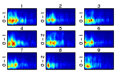
Figure 21 depicts the results of training a small SOM with a small music collection. Classical music can be found in the upper left, music with very strong beats in the lower right.
Using the Median-based vectors, we directly obtain a representation of the various pieces of music as given below.
(For detailed descriptions of resulting maps, as well as interactive examples with links to audio samples, please refer to the experiments-section on this website.)
|
| Figure 21: A 7x7 SOM trained with 77 pieces of music. |
(Up to the Overview)
5. Map Interface: Islands of Music and Weather Charts
5.1. Islands of Music based on Smoothed Data Histograms (SDH)
The metaphor
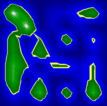
of islands is used to visualize music collections. The islands represent groups of similar data items (pieces of music). These islands are surrounded by the sea, which corresponds to areas on the map where mainly outliers or data items, which do not belong to specific clusters, can be found. The islands can have arbitrary shapes, and there might be land passages between islands, which indicate that there are connections between the clusters. Within an island there might be sub-clusters. Mountains and hills represent these. A mountain peek corresponds to the center of a cluster and an island might have several mountains or hills.
Several methods to visualize clusters based on the SOM can be found in the literature. The most prominent method visualizes the distances between the model vectors of units which are immediate neighbors and is known as the U-matrix. A different approach is to mirror the movement of the model vectors during SOM training in a two-dimensional output space using Adaptive Coordinates. We use Smoothed Data Histograms (SDH), where each data item votes for the map units which represent it best based on some function of the distance to the respective model vectors. All votes are accumulated for each map unit and the resulting distribution is visualized on the map. As voting function we use a robust ranking where the map unit closest to a data item gets n points, the second n-1, the third n-2 and so forth, for the n closest map units. All other map units are assigned 0 points. The parameter n can interactively be adjusted by the user. The concept of this visualization technique is basically a density estimation, thus the results resemble the probability density of the whole data set on the 2-dimensional map (i.e. the latent space). The main advantage of this technique is that it is computationally not heavier than one iteration of the batch-SOM algorithm.
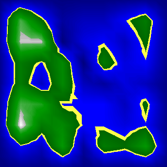
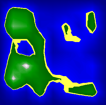
To create a metaphor of geographic maps, namely islands of music, we visualized the density using a specific color code ranges from dark blue (deep sea) to light blue (shallow water) to yellow (beach) to dark green (forest) to light green (hills) to gray (rocks) and finally white (snow). In this paper we use gray shaded contour plots where dark gray level can be regarded as deep sea, followed by shallow water, flat land, hills, and finally mountains represented by the white level.
The sea level has been set to 1/3 of the total color range, thus map units with
a probability of less then 1/3 are under water. The sea level could be adjusted
by the user in real time, the involved calculations are neglectable. The visible
effects might aid understanding the islands and the corresponding clusters better.
Figures 22 to 24 illustrate different parameter settings used to visualize the demonstration. Notice that higher values for n cause the islands to grow together while lower value result in many small and scattered islands. Since this parameter is applied at the very end of the whole process and can quickly be calculated the user can adjust this value in real time when exploring the map, and gain information not only from the structure of islands at a specific parameter setting, but also through analyzing differences between different settings.
|
| Figure 22: n=1. |
|
| Figure 23: n=2. |
|
| Figure 24: n=3. |
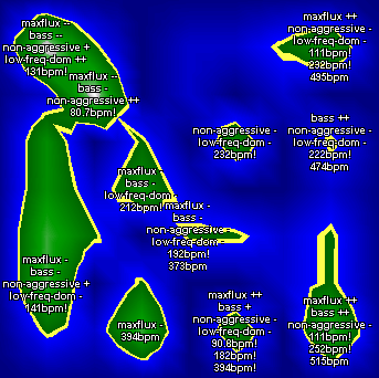
The island visualization can easily be combined with any labeling method. For example, the islands can be labeled with the song identifiers. On the other hand these identifiers, when assuming that the songs are unknown to the user, do not help the user understand the clusters. However, most standard approaches for SOM labeling rely on the selection of specific features that are characteristic for a given region. This cannot be applied directly to music clustering and the methods introduced in the SOMeJB system, since the single dimensions of the 1200-dimensional modified fluctuation strength vectors are rather meaningless. For example, the MFS value at the modulation of 2.4Hz and bark 4 would not be very useful describing a specific type of music.
Since the single dimensions are not very informative aggregated attributes can be formed from these and can be used to summarize characteristics of the clusters. There are several possibilities to form aggregated attributes, for example, using the sum, mean, or median of all or only a subset of the dimensions. Furthermore, it is possible to compare different subsets to each other. In the following 4 aggregated attributes, which point out some of the possibilities, are presented, forming Weather Charts that help the user to understand the characteristics and tendencies of the various islands. If the user understands the MFS it is possible that the user directly creates the aggregated attributes depending on personal preferences. The used aggregated attributes are Maximum Fluctuation Strength, Bass, Non-Aggressive, and Low Frequencies Dominant. The names have been chosen to indicate what they describe.
Other interesting aspects of the MFS include the vertical lines that correspond to beats at specific frequencies. To extract information on these a simple heuristic can be used to find significant beats. First the sum over all critical-bands for each modulation frequency of the MFS are calculated and normalized by the maximum value so that the highest value equals one. High peeks correspond to significant beats and are found using the following rules. (1) All peeks below 43% of the maximum are ignored. (2) All other peeks need to be at least 12% higher then the closest preceding and the closest succeeding minima. (3) Finally from the remaining peeks only those are selected which are higher then any other remaining peek within the modulation frequency range of 1Hz.
An example of the resulting labeling is provided in Figure 25.
|
| Figure 25: Aggregate labels describing rhythmic properties are assigned to map peaks. |
(Up to the Overview)
6. Selected Publications and Links on Prototype 2
(Up to the Overview)